Tag Archives: Parallel Design
day four – basic floral design I at longwood
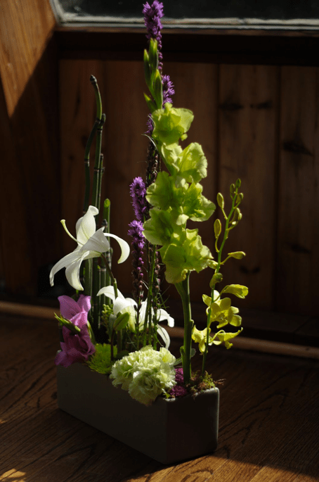
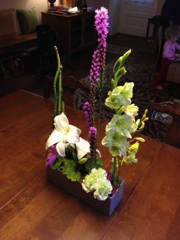
Today’s lesson was to create a Parallel Design, a design that’s meant to have a calming effect. In a regular decorative design, like the Roundy Moundy, the overall shape is dominant. But in a formal linear design, the forms and lines are dominant. The lines in this design are created by grouped plant material set in a vertical pattern with negative space between each section. The negative or empty spaces allow the eye to travel through the arrangements. We talked about parallel designs with Landscape Designs, but this one is different because we are not mimicking how you’d see plants in nature, and we’re not necessarily combining plants that are seasonally compatible. In other words, let her rip!
We started by filling a low container with Oasis floral foam, shaved to the lip of the container (important for a clean line, clean look.) Nothing much should be hanging over the edges in the parallel design. Jane recommends attaching an Apidistra leaf with greening pins to cover up the foam at this stage, rather than going back and filling in with moss at the end. (Some stems will poke right through the leaf, whereas a hole will have to be made for other, more tender ones.) We’ll be using a lot of basing techniques at the end to conceal the mechanics, but the terracing using Galax leaves is easier to do at the beginning. Terracing is simply placing materials on top of one another, divided by space, like a staircase.
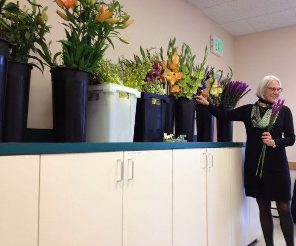
Linear plant material is a must for this design, and we had lots to choose from, like gladiola, liatris, and equisetum. Hold the line flowers/foliage up over the design to see where it looks best, and vary the heights. The idea is to keep the same plant material grouped together for a bigger impact and to keep the lines stronger. They should all be placed in as straight as possible! With lilies in the mix, the only way to go was to keep them low or they took up too much of the space at the top of the design – reserved for negative space.
Depth is created by angling stems, overlapping materials, and the use of color (light colors pop out while darker ones recede.) The lines create negative and positive space.

Notice how Pat trimmed her Equisetum on a diagonal cut for effect (sorry Pat I didn't get the bottom of your design!)
Next, we did our basing techniques to cover the mechanics and to create color and texture. Pillowing is creating a tight, round pillow out of a few stems placed radially. Tufting uses bunches of short stems to create an airy look. Pavé-ing is a tight clustering technique where the surface of the bunches remains totally flat, creating a cobblestone effect. (Pavé as in the jewelry technique, too.)
This design really opened my eyes to the possibilities of parallelism. I think these would make great table centerpieces because you can see through them easily and they look good from all sides. You create a little mini world in a box that has nothing to do with the way plants would really be growing and it’s kind of liberating. Also, it’s been said that men prefer these vertical designs.


