I was on the waiting list for this class, and at the last minute I got in! It’s a Saturday class that meets from 9-4, an all day affair, and was actually a bit intense, because we squeeze two classes into one day. The teacher is the same as my Basic class, Jane Godshalk, thankfully, but there were only a few students that I recognized. The rest seemed to be on some other plane of advanced floral design! I felt as if I were coming from the minor leagues to the big time, looking around at all the creative touches I never would have thought of going on around me. Jane kept saying, “you’re in Advanced now, people…”

Instructor Jane Godshalk's Linear Design
We started by discussing Linear Qualities in Design. Line can be static or dynamic; there are both primary and secondary lines. Here are some of the many line types:

Linear Qualities in Design
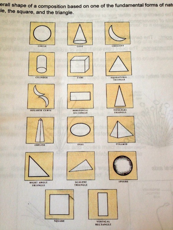
In a Linear Design the line is dominant – the negative space powerful. The lines can become a geometric form – circle, square, triangle and every combination of those forms.

All geometric shapes are some variation of circle, square or triangle (the fundamental forms of nature)
There are a few really important ideas to consider when conceiving of a design plan: the vertical axis, which may be visible or invisible in the design; the binding point (the central binding point) and the point of emergence (the point from which lines of a design begin, also usually the binding point. confusing.)

think about the vertical axis and binding point!
Also, consider the focal point or focal area – this is the area of greatest impact in a design – to which the eye is naturally drawn. It’s usually close to the binding point. There are many ways to achieve focal interest:
- Color – darker flowers have more visual weight than lighter colors
- Size – larger, more open blooms have more visual weight
- Shape and Pattern – form flowers have greater interest
- Spacing – closer spacing makes flower appear heavier
- Texture – contrasting textures create visual interest – Shiny foliage is focal
- Line Direction – radiating lines attract interest to center of design
Here are some basic flower arrangement designs. This gets you thinking that there’s no end to what you could do!
 This morning we do two linear designs. Jane recommends really planning out your design – choosing your style (decorative, vegetative, form+ line, abstract,) choosing the dominant element, flower forms, color palette, and planning your vertical axis. Make a sketch before you begin! The first design we do will have a visible axis and will incorporate some techniques from Basic like pave and terracing.

my sketch, vertical axis will be off to the left. all i know at this point is that snapdragons will be my line flower and a lily will be the form flower and focal point.

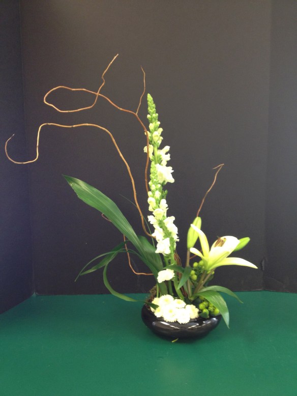
My linear design with visible axis. Jane had to help me remember about point of emergence!

another student's linear design with visible axis
Moving on, we are to create Design 2 – a Linear design with an invisible/imaginary axis. We have a nice white Ikea vase to play with. Again, we make a sketch and plan all the elements: dominant element, flower forms, palette, and where is the imaginary vertical axis. All I know is, I’m using those Bells of Ireland (I will have to wire them to make them the shape I want) and green mums, and my imaginary axis will be in the center. I want to do something curvy.

my sketch for design #2

My linear design with imaginary axis - Jane says "it's almost a Hogarth Curve!" I think the imaginary axis ended up being slightly left of center.
After lunch break, it’s time to tackle the Phoenix Design, for which we’ve brought containers from home. I was lent a beautiful silver Revere bowl by Juliet. The Phoenix Design, interestingly, is the only design we’ll be learning that is attributed to American designers. And yes, it is inspired by the mythological bird that cyclically sets itself on fire and rises from it’s own ashes to begin another long life. So the design is all about renewal and rebirth.

Phoenix depicted in the book of mythological creatures by F.J. Bertuch (1747-1822)
The Phoenix design is a composition in which tall materials burst from the center of a round arrangement in a radial fashion with a triangular shape.

slideshow - one of Jane's Phoenix designs she created for a party
Our mechanics for this arrangement, which is great for big parties, begin with a block of soaked Grande oasis put into a liner and then into the container. Others had varying shaped containers and needed to secure the foam with chicken wire and tape – mine was steady so I didn’t need to do that. Start by grouping various foliage at the base, leaving a hole in the center for the fireworks. Remember the base is to be a round shape. We used Ruscus, Ming Fern, and Apidistra leaf (Jane’s fave,) which she showed us how to bend in on itself, and poke the stem through the leaf to create a bulkier shape. Then put in your line flowers, in this case Gladiolas, using radial lines. These tall line flowers should create an upside down triangle from all sides (easier said than done!)

Jane demonstrates the Phoenix design
We did create a sketch first but I think you get the picture here. After a mad rush to get our flowers, we spend an hour or so making this one. The person next to me seems to require a lot of space so I move to the counter space behind me – it’s really hard to see your line and form with so much happening visually in the room. After putting in the line flowers, we fill in the rounded form at the base with roses, alstromeria, carnation, waxflower, etc. I end up using more roses instead of carnations, because there are some left over. In these classes, you try to play by the rules regarding how much plant material you’re allowed, but if you pay attention you can often grab some extras after everyone has taken what they need.

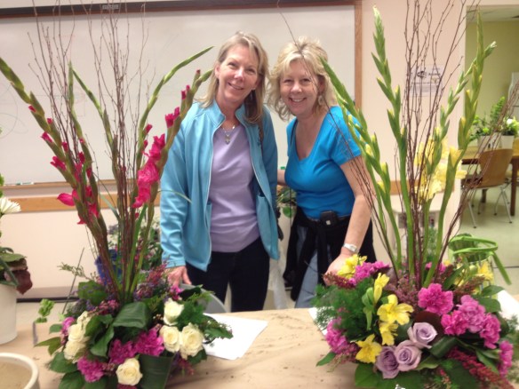
Sisters with their Phoenix designs

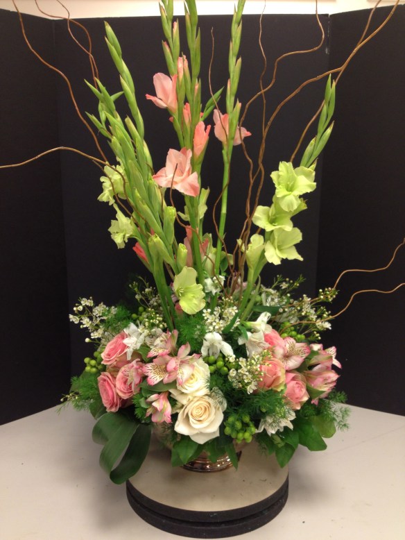
my phoenix design with a few extra glads and roses thanks to jane
In choosing the colors, I started with the green glads and wanted pink roses to complement them, especially because the intended location for this guy was June’s house (June is 2) and her favorite color is pink. I accidentally cut my glads too short and ended up putting a bunch of myrtle in to compensate – which during our evaluation in front of class, Jane took out, leaving just the curly willow. I’m glad she did this, I think in Basic she doesn’t critique our designs quite as much but how are you going to learn, right? Anyway, this design is very big and didn’t end up fitting at the intended location! So it’s up at the ‘big house’ lasting quite well though because of it’s size it’s a bit thirstier than other arrangements I’ve made.

my Phoenix design in a home setting
After a long day in Advanced I’m pretty fried- in a good way. I made it!
39.908889
-75.349583


